
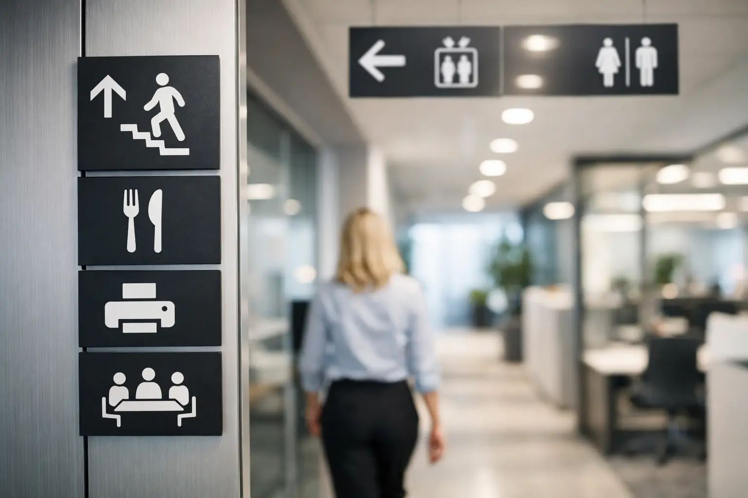
A visitor should not need to ask for directions three times before reaching a meeting room. Nor should a new employee wander through an office searching for reception, washrooms, elevators, or a department head. Effective office wayfinding signage design removes that friction while turning every corridor, door, and decision point into a polished expression of your brand.
For offices in Abu Dhabi, Dubai, and across the UAE, wayfinding is more than a decorative interior detail. It affects visitor confidence, staff productivity, facility safety, and the perceived quality of your operation. When the signage is unclear, inconsistent, poorly placed, or made from the wrong materials, even a premium office fit-out can feel disorganized. When it is engineered correctly, the workplace feels controlled, welcoming, and ready for business.
Start With How People Actually Move
Strong wayfinding begins before colors, fonts, or materials are selected. It starts with the movement of real people through the space.
A facility manager may understand the building layout instinctively, but a first-time visitor does not. They enter through a lobby, look for reception, wait for access approval, use an elevator or corridor, and then make a series of small decisions. Every one of those decisions is a potential point of confusion.
Map the full visitor journey from parking and entry to reception, meeting rooms, work zones, amenities, exits, and elevators. Then identify where people pause, turn, hesitate, or ask questions. These are the locations where directional signs deliver the most value.
This approach matters especially in multi-floor corporate offices, medical and professional service centers, large showrooms, shared workspaces, and industrial administration buildings. A sign placed only at the destination is too late. Directional information must appear before the visitor reaches the decision point.
Create a Clear Sign Hierarchy
Not every sign should compete for attention. A reliable system gives each type of information a defined role.
Primary signs handle major destinations such as reception, departments, floor numbers, elevators, and emergency exits. Secondary signs guide people along corridors and toward rooms or facilities. Identification signs label meeting rooms, offices, utility areas, and washrooms. Regulatory and safety signs communicate mandatory instructions, hazards, access restrictions, and evacuation information.
When these categories use the same visual weight, users struggle to identify what matters most. Primary wayfinding should be visible from a distance. Room labels can be more discreet. Safety signage must remain highly legible and compliant without being buried inside decorative graphics.
Office Wayfinding Signage Design Must Be Instantly Readable
The fastest route is not always the best route for a sign. A long phrase, small typeface, low-contrast finish, or overly clever icon may look stylish on a design board but fail in a busy office environment.
Use direct language. “Reception,” “Meeting Rooms,” “Finance,” and “Washroom” work because they require no interpretation. If bilingual signage is needed for your workplace, Arabic and English should be planned from the start, not squeezed into an existing layout at the final production stage. Both languages need balanced spacing, strong contrast, and equivalent visibility.
Typography should be clean and large enough to read at the intended viewing distance. Thin decorative fonts may align with a luxury brand identity, but they can become difficult to read under glare, from a corridor, or for visitors moving quickly. In most professional environments, clarity should lead and style should reinforce it.
Color contrast is equally critical. Light gray lettering on frosted glass may be subtle, but it often disappears under changing daylight. A dark acrylic panel with crisp white text can offer stronger visibility. The right solution depends on lighting, wall color, brand palette, viewing angle, and the formality of the space.
Build Brand Presence Without Creating Visual Noise
Wayfinding signs should feel like part of the office brand system, not an unrelated collection of printed arrows and door stickers. The strongest programs connect the company logo, brand colors, typography, wall graphics, reception features, and directional signage into one controlled visual language.
That does not mean placing a large logo on every sign. Overbranding can slow down navigation and make the space feel promotional rather than professional. Instead, use brand elements with discipline: a signature color band, a consistent icon style, a recognizable panel shape, or a refined material palette can establish identity without distracting from the message.
A corporate headquarters may benefit from brushed metal directories, dimensional lettering, and clean acrylic panels. A creative agency could use bold wall graphics, colored zones, and expressive room naming. A logistics or industrial office may prioritize high-contrast, durable signs that remain clear in high-traffic, dust-prone areas. Office wayfinding is not one-size-fits-all. It must reflect both the brand and the demands of the site.
Use Materials That Match the Environment
Material selection directly affects appearance, lifespan, maintenance, and budget. Indoor signage still faces wear from cleaning, fingerprints, air-conditioning, sunlight through glass facades, and constant visitor contact.
Acrylic is a versatile choice for door signs, directories, and reception features because it can be laser-cut, printed, layered, or mounted with premium standoffs. Aluminum composite panels provide a durable, crisp surface for directional boards and larger wall-mounted signs. Vinyl graphics work well on glass partitions and walls when applied with precision. Dimensional letters create authority at reception areas and executive zones, while photoluminescent or standardized safety materials may be required where emergency visibility is a priority.
The lowest initial price is not always the most economical decision. Thin materials, weak adhesives, poor edge finishing, and low-grade print surfaces can peel, fade, or look tired long before the office fit-out reaches its expected lifespan. Choosing durable materials protects the visual standard of the workplace and reduces replacement disruption.
Coordinate Wayfinding With Safety and Compliance
A polished office cannot treat life-safety information as an afterthought. Emergency exits, fire equipment, staircases, assembly instructions, restricted rooms, electrical areas, and hazard zones need signage that is visible, correctly positioned, and aligned with applicable building and UAE requirements.
This is where design and technical execution must work together. Decorative wall graphics should never obstruct emergency information. Glass branding should not make safety markings difficult to see. Directional signs must not create confusion around evacuation routes or block required access paths.
For facilities managers and project teams, early coordination saves time. Review the signage plan alongside fit-out drawings, fire and safety requirements, access-control locations, lighting, and landlord guidelines. Late changes often lead to mismatched signs, rushed installation, and unnecessary cost.
Design for Updates, Not Just Opening Day
Businesses change. Departments relocate, meeting rooms are renamed, staff functions expand, and tenants move between floors. A fixed signage system that cannot be updated becomes expensive and inconsistent over time.
For areas likely to change, consider modular directories, replaceable inserts, or panels designed for updated vinyl graphics. Permanent dimensional signage makes sense for stable locations such as reception, major departments, or core amenities. Flexible formats are smarter for room allocations, tenant listings, and temporary operational notices.
Digital displays can also support high-change environments, particularly for reception directories and meeting room schedules. However, digital wayfinding should not replace essential physical signs. A screen can be offline, occupied with another message, or overlooked by someone already moving through the space. Physical signs remain the dependable foundation.
Installation Is Part of the Design
A perfectly fabricated sign can still fail if it is installed at the wrong height, mounted off-center, or placed behind an open door. Installation quality determines whether the design performs as intended.
Before final fixing, confirm sightlines from entrances, elevators, corridor intersections, and waiting areas. Check that signs are level, consistent in height, and readable under actual site lighting. For glass-mounted graphics, consider what the sign looks like from both sides and how it interacts with reflections. For wall-mounted panels, ensure fixing methods suit the wall substrate and maintain a clean finish.
A single accountable signage partner can make this process far more controlled. From site survey and design development to material recommendations, fabrication, compliance review, installation, and quality inspection, connected project handling prevents the gaps that often appear when multiple vendors are involved.
Measure Success by Fewer Questions and Stronger Impressions
The results of wayfinding are often visible in everyday behavior. Reception teams spend less time giving repeat directions. Visitors arrive at meetings on time. Employees move through the office with less interruption. Contractors and delivery personnel understand where to report. The space feels easier to trust because it feels organized.
A Plus Advertising LLC approaches office signage as a business asset built for visibility, durability, and operational clarity. The goal is not simply to fill walls with signs. It is to create a system that guides people confidently while giving your workplace the level of visual authority your brand deserves.
The best time to plan wayfinding is before confusion becomes part of the daily routine. Walk your office as if you have never been there, follow the questions a visitor would ask, and let every sign provide a clear, confident answer.